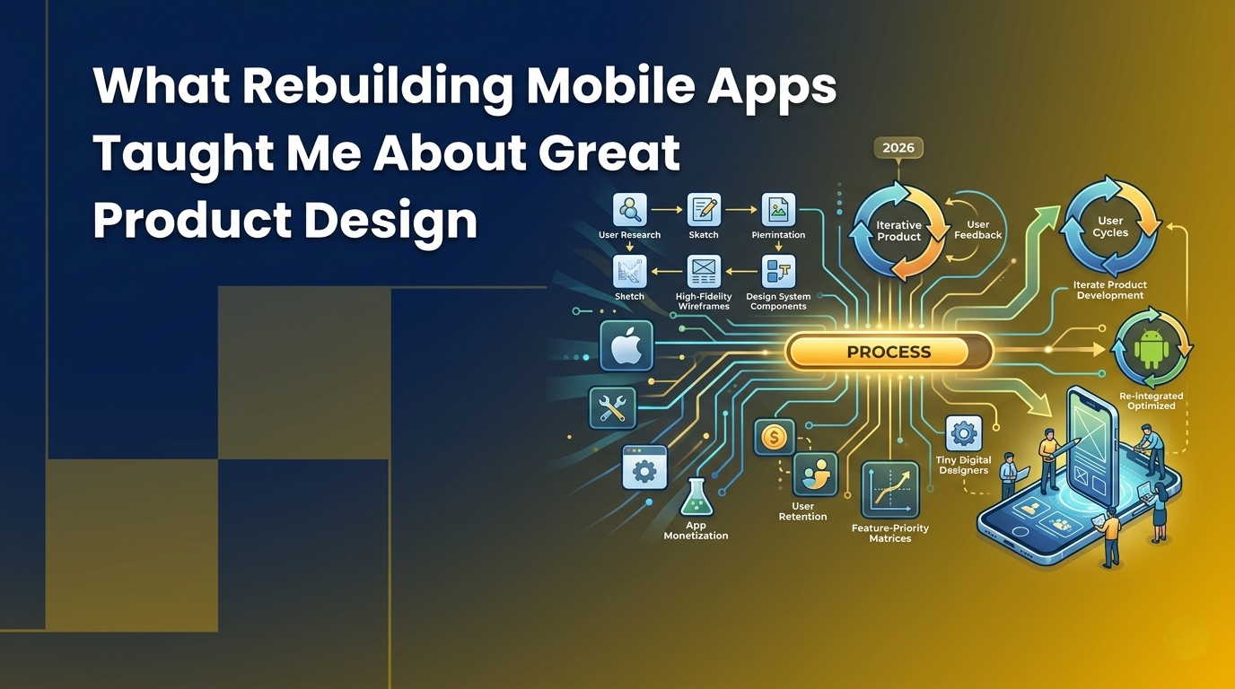
What Rebuilding Mobile Apps Taught Me About Great Product Design
Most people use apps. A smaller, dedicated group builds them. But an even smaller, slightly obsessive subset spends their free time rebuilding apps they don't even own.
Over the last few months, I've developed a habit of recreating major mobile applications from scratch. To be clear: I’m not reverse-engineering them, extracting APKs, or sneaking a peek at their source code. Instead, I simply observe them intently and rebuild the front-end experience entirely from raw observation.
Sometimes I use React Native; sometimes Flutter. Occasionally, I'll reach for native platforms or whatever tool feels right for the job. But the framework isn't the interesting part. The interesting part is the process.
You start with a finished product that already exists in the wild a food delivery giant, a slick messaging app, or a high-converting e-commerce experience. These are products that feel polished, intuitive, and effortless. Then, you try to recreate it. Not the infrastructure, not the heavy backend business logic, but the experience the screens, the navigation, the transitions, and the subtle micro-interactions that most users never consciously notice.
Somewhere along the way, you stop looking at software the same way.
UI Simulation vs. Code Cloning
When I tell colleagues I rebuild apps, they often assume I'm talking about building a clone. I'm not. There is a massive distinction between the two approaches:
- A clone attempts to reproduce the product's underlying functionality and database architecture.
- A UI simulation attempts to reproduce the product's felt experience.
Think of a UI simulation less like counterfeiting and more like building a movie set. A movie set can look and feel exactly like a real city street while being entirely constructed from plywood, canvas, and paint. The goal isn’t to recreate the underlying plumbing; it’s to recreate the feeling of being there.
In a simulation, the data is hardcoded, the state is tightly controlled, and the APIs are mocked. Yet, because it navigates like the original and the buttons behave exactly as a user expects, the illusion is seamless.
Why Build a UI Simulation?
This is usually the first question people ask: why spend weeks recreating an app when the original is already sitting right there in the App Store?
Because rebuilding something teaches you structural lessons that simply using it never will.
When you are just a user, your brain is transactional you want to order food, text a friend, or transfer money. You seamlessly glide past the layout because the design is successfully doing its job of staying out of your way.
But the moment you try to recreate that interface from scratch, those invisible design choices become impossible to ignore. You stop looking at the screen as a static picture and start looking at it as an engineer trying to build it. You are forced to figure out why a certain button changes color exactly when it does, how a menu collapses when you scroll, and where a user's eyes are being led.
In a professional engineering setting, building a UI simulation is the ultimate way to develop muscle memory for high-fidelity prototyping. It strips away the distractions of databases, server crashes, and API authentication, leaving you alone with the pure user experience. It changes your relationship with software. You move from being a passive consumer to an active decoder of exceptional design.
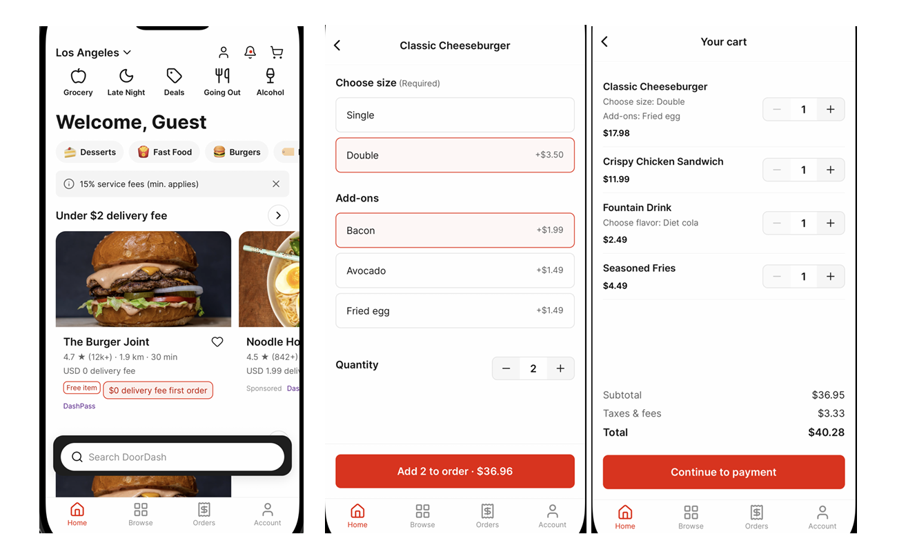
Case Study: How I Built a DoorDash Simulation
To see what this looks like in practice, let’s walk through how I engineered a high-fidelity simulation of DoorDash. The goal wasn't to route real drivers or process actual credit cards; it was to fool a user's thumb into thinking they were ordering a real burrito.
Here is the exact, step-by-step process I used to break down and rebuild the platform:
Step 1: Mapping the Core User Flow
Before opening an IDE, I mapped out the essential psychological journey a user takes on DoorDash. I mapped the path down to three primary views:
- The Discovery Feed: The complex home layout featuring carousels, active filters, and restaurant cards.
- The Storefront Menu: The nested restaurant menu featuring sticky category headers and item modifiers.
- The Cart & Checkout: The slide-up sheets and summary page that handles dynamic state calculations.
Step 2: Extracting the Spatial & Visual Rules
I took dozens of native screenshots of DoorDash and pulled them into a scratchpad. By overlaying a digital grid, I cracked their core design tokens. I discovered they strictly adhere to an 8dp spacing system for structural elements, with a tighter 4dp padding rule for text-to-icon alignments. I hardcoded their exact semantic color palette DoorDash Red (#FF3008), dark text neutrals, and background off-whites, directly into my project constants before writing any structural layout code.
Step 3: Engineering the Interactive Discovery Feed
The DoorDash home screen is incredibly dynamic. The trickiest engineering feat here was the search/header bar interaction. As the user scrolls vertically down the page, the top location picker beautifully fades out, while the category pill filter row smoothly transitions into a sticky top navigation bar. I used an animated scroll listener to seamlessly interpolate these visual properties based on the exact Y-axis offset of the main feed.
Step 4: Cracking the Nested Storefront Scrolling
The menu view is a masterclass in frontend complexity. As you scroll through a restaurant's menu, the horizontal category bar at the top automatically shifts highlight tabs depending on which food section is currently visible on the screen.
To achieve this in the simulation without a backend, I mapped out layout coordinates using layout measurement callbacks. When a section hit the threshold viewport, the top horizontal scroll view automatically centered itself on the active category.
Step 5: Seeding the Mock State Engine
To make the checkout flow look authentic, I built an internal local state engine pre-seeded with highly realistic metadata: actual local restaurant names, real-world menu prices, and descriptive food imagery. When a user clicks "Add to Cart", the button transforms into an active quantity counter, and a bottom persistent sheet updates its total subtotal locally in real-time. It completely removes API latency, making the app feel incredibly fast and satisfyingly responsive.
The Hidden Complexity of Observation
One of the biggest surprises I encountered was realizing that implementation wasn't the hard part observation was. Most people think they understand an app because they use it daily.
In reality, our brains are optimized to reduce cognitive load; we only focus on accomplishing an immediate task and completely miss the design mechanics making it happen.
When I start a project, I spend days just studying the target app. I record user flows, take hundreds of screenshots, and watch transitions frame-by-frame at 0.25x speed. A "simple" application quickly stops looking simple. You realize a single home screen isn't just a layout it's a matrix of distinct states:
- The Skeleton: The shimmering loading state that keeps the user engaged.
- The Empty View: What the user sees before any personal data exists.
- The Happy Path: The fully populated, ideal UI layout.
- The Edge Cases: Error states, offline banners, and pull-to-refresh behaviors.
What initially appears to be a 20-screen app easily blossoms into over 100 distinct UI states once you start documenting the edge cases.
Every Good App is a Design System in Disguise
When I first started, I approached these projects screen by screen. I would build one view, move to the next, and immediately realize I was reinventing the wheel.
The world's best product teams don't think in screens; they think in systems. Once you stop looking at individual pages and start looking for the underlying architecture, the interface becomes incredibly predictable.
Managing Scope and Knowing When to Stop
In a professional product development cycle, you quickly learn about the law of diminishing returns. The same applies to UI simulation. The final 5% of polish often takes as much engineering effort as the first 95%.
Perfect fidelity is an illusion. There is always another nested settings screen, another rare error state, or another deeply buried interaction. Learning where to draw the line is a massive engineering skill. Some projects demand pixel-perfect accuracy on a single micro-interaction; others only need representative behavior across a primary user flow to prove out a UX concept.
The Ultimate Takeaway
If there's one thing rebuilding apps has taught me, it's that nothing in a great product is an accident. As casual users, we only experience the frictionless final result. But as builders who take things apart to see how they work, we get to appreciate the thousands of deliberate decisions hiding beneath the surface. The spacing wasn't a guess. The animation timing wasn't a default value. The typography wasn't chosen on a whim. Everything that feels effortless was intensely designed to feel that way.
Rebuilding products hasn't just given me a portfolio of sleek UI prototypes. It has fundamentally rewired how I see software. I no longer see apps as collections of static views; I see them as living, breathing ecosystems of systems, patterns, and intentional choices.
The same systems thinking that helps you rebuild a product also changes how you think about quality. When you start seeing applications as collections of states, interactions, and user journeys rather than isolated screens, you gain a deeper appreciation for both product design and testing. It's a mindset I continue to explore through projects like these and in my work at QApilot, where understanding real user experiences is just as important as validating functionality.
And once you train your eyes to see software that way, you can never look at an interface the same way again.